


 Unity
Unity Unreal
 Godot
Godot
 Mobile
 PC
PC Console
 Full-Cycle
 Co-Development
 Outstaffing




-
 Art & Design
 Aug 7th, 2026
- Share:
Table of Contents
- TL;DR
- What "locking art direction" actually means
- Stylized vs. realistic: The real cost and production trade-off
- What actually goes into an art bible that works
- How to hold visual consistency as the asset set grows
- Decision framework: How to choose for your project
- What this means for your budget, timeline, and partner choice
- Conclusion: Lock the direction, then scale it
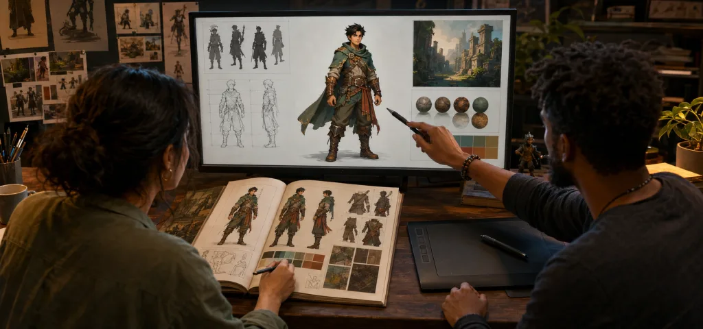
Locking your game’s art direction is a pre-production decision, not something you discover while assets ship. The short answer: pick the direction on a small set of hero assets before scaling to full production, write it down as a working reference rather than a mood board, and put one named owner in charge of holding it as the asset count grows. Skip any of those three, and the style call you make in week one turns into a rework bill you’re still paying months later, once outsourced artists and a growing team are all touching the same asset set.
TL;DR
- Locking art direction means freezing the visual style, shape language, and color/material rules before full production starts, rather than figuring it out when assets ship. Revisiting style mid-production means reworking everything built before the change.
- Stylized art isn’t automatically cheaper. It shifts cost from rendering and texture fidelity to upfront design decision-making. Skip that decision-making, and stylized pipelines can rack up as much rework as realistic ones.
- Think of an art bible as a working reference, not a pitch deck: shape language, proportion rules, palette and material logic, lighting intent, and do/don’t examples an outsourced artist can follow without asking.
- Visual consistency doesn’t hold on its own past 30 to 40 assets and 2 to 3 artists. It holds because someone owns a review checkpoint against the bible at defined intervals.
- 64% of visual and technical art professionals now hold an unfavorable view of generative AI’s impact on the industry, per GDC’s 2026 State of the Game Industry survey. This is a signal that human-authored, well-documented art direction is becoming more valuable, not less, as AI-assisted asset generation spreads.
What "locking art direction" actually means
Locking art direction means the studio has committed to answers on the big visual questions, covering shape language, proportion rules, color and material logic, lighting mood, and rendering fidelity, before the team starts building production assets at volume. That commitment has to happen on purpose. A mood board that keeps quietly evolving through production isn’t a locked direction.
Most studios don’t struggle to generate visual ideas in pre-production. They struggle to stop generating them. Concept art keeps evolving, “just one more direction” keeps getting explored, and the team drifts into production without a hard cutoff. That’s expensive in a specific way: every asset built before the direction is locked is now a candidate for rework the moment the direction actually locks. A character rigged and textured against direction A doesn’t survive a pivot to direction B. The whole asset gets rebuilt from scratch.
The fix is containing the decision, not rushing it: build and lock a small set of “hero” assets first, one character, one environment piece, one prop, during pre-production, so the studio can pressure-test the direction on real geometry, real lighting, and a real engine before 40 more assets get built against it.
Stylized vs. realistic: The real cost and production trade-off
The short answer: stylized art generally costs less to produce per asset, but only if the studio invests in the direction work upfront. Realistic art costs more per asset but is more forgiving of loose direction, because physically-based reference does a lot of the consistency work for you.
That trade-off comes down to where the cost sits in the pipeline, not polygon counts or texture resolution.
Where realistic art spends its budget
Realistic pipelines lean on production discipline more than creative judgment. PBR texturing, high-fidelity rigging, motion capture, and lighting all have established, referenceable standards. A lot of the “is this right?” question gets answered by physics and photographic reference rather than by the art director. That predictability is exactly why realistic productions tend to run longer and cost more per asset: higher poly budgets, multi-pass texturing, and animation work that has to read as physically correct, with less room to fudge a joint or a fold.
Where stylized art spends its budget
Stylized pipelines can be lighter on raw asset cost: simpler topology, more forgiving textures, and animation that can cheat physics for readability. But every one of those simplifications is a judgment call, and judgment calls made inconsistently across a team are exactly what produces rework. A style that isn’t clearly defined in shape language, proportion, and material rules doesn’t fail loudly. It fails asset by asset, as each artist’s personal interpretation drifts slightly from the last one, until a producer notices the environment set doesn’t read as one game.
That’s the trap worth naming directly: stylized art doesn’t save money by default. It saves money only when the studio front-loads the direction work: locked shape language, a proportion system, and clear material rules that keep every artist’s interpretation of “stylized” pointed at the same target. Skip that step and a stylized project can burn as much or more time in revision cycles as a realistic one would have spent on raw rendering fidelity.
The middle path
Most commercially shipped games land somewhere between pure realism and pure stylization, in territory often called “grounded” or “semi-stylized”: realistic proportions with simplified surface detail, or stylized shapes with physically-plausible lighting. This middle path gets the production-speed benefit of simplification without losing the visual polish buyers associate with premium titles, but it demands the most documentation, because “grounded” is the hardest style to describe consistently in words. If your project sits here, the art bible carries more of the weight than it would at either extreme.
| Factor | Stylized | Realistic | Grounded / hybrid |
|---|---|---|---|
| Per-asset production cost | Lower, if direction is locked | Higher, more predictable | Moderate |
| Dependence on upfront direction work | Very high, style drifts fast without it | Lower, physical reference constrains drift | Highest, hardest to describe in words |
| Hardware / platform flexibility | Best for mobile, cross-platform, live-ops scale | Demands stronger hardware, longer load/build times | Depends on fidelity target |
| Team skill requirement | Strong shape/design sensibility across every artist | Strong technical/PBR discipline | Both, in smaller doses |
| Risk if direction isn’t locked | Rework compounds across every asset silently | Rework is visible faster (reads as “wrong” sooner) | Hardest to catch drift early |
What actually goes into an art bible that works
An art bible is the operational document that lets an artist who wasn’t in the original creative conversation still produce an on-model asset. If your bible reads like a pitch deck full of mood boards and adjectives, it’s not doing that job yet.
Visual pillars, in specific terms
Skip “gritty and atmospheric.” Get specific: silhouette rules (readable at X meters, Y-degree camera angle), proportion ratios (head-to-body, hand-to-forearm), and 3 to 5 reference images per pillar showing what’s in- and out-of-style. The out-of-style examples matter as much as the in-style ones, since they’re what stops an artist’s personal taste from creeping in.
Shape language and construction rules
For stylized work specifically, shape language has to be locked before anything goes to 3D blockout: are silhouettes built from rounded primitives or angular ones? Is exaggeration applied to hands, heads, or weapons? These rules get tested on the hero assets first, then written down as rules, not just shown as pictures.
Color and material logic
A palette isn’t a swatch grid. It’s a system: which colors read as “friendly/hostile,” “interactable/background,” “hero/environment.” Material rules follow the same logic: what does metal look like in this world, what does organic material look like, and where does the line sit between the two?
Lighting intent and mood
Light direction, color temperature, and contrast ratio shape tone as much as geometry does. This section should show the same asset under “correct” and “wrong” lighting so an environment artist two time zones away can self-check without waiting on a review.
Do/don’t examples, not just do examples
The fastest way to compress review cycles is showing near-misses: an asset that’s 90% on-model and explaining exactly what pushes it off. That single page prevents more rework than the rest of the bible combined, because it teaches the specific failure mode rather than the abstract rule.

How to hold visual consistency as the asset set grows
A bible holds for the first handful of assets almost regardless of how good it is. A single artist, or two who talk constantly, will naturally stay aligned. It stops holding somewhere around 30 to 40 assets and 2 to 3 artists working in parallel, because that’s the point where no one person is looking at every asset anymore, and small individual interpretations start compounding into a visible drift.
Three things keep it from drifting past that point:
A named owner. An art director, not a rotating reviewer, has final sign-off against the bible. Consistency degrades the moment “everyone” owns it, because everyone assumes someone else is checking.
A review cadence tied to milestones, not vibes. Batch review at defined checkpoints (every environment set, every character wave) against the bible specifically, not against “does this look good,” which is a different and looser question.
A bible that gets amended, not just enforced. Real production surfaces edge cases the original bible didn’t anticipate: a creature type, a UI state, and an environment biome. When that happens, the fix goes into the bible itself, with the new example added, so the next artist who hits that edge case doesn’t reinvent the answer.
This becomes more important, not less, once art production is split across an internal team and an outsourced partner, or across multiple outsourced artists working different asset categories in parallel. That’s the normal shape of AA/AAA art production today. The bible is what lets a partner team hold your style without a Juego art director sitting in every review, and it’s the foundation for maintaining visual consistency with outsourced art teams once that partnership is underway.
Decision framework: How to choose for your project
Work through these in order. Each answer narrows the next one:
- What’s the platform ceiling? Mobile and cross-platform live-ops titles lean stylized by default; the hardware headroom for realistic fidelity usually isn’t there, and stylized art degrades more gracefully across device tiers.
- What’s the team’s actual strength? A team with strong illustrators and character designers will out-produce a forced realistic pipeline. A team with strong technical/PBR artists will do the reverse. Don’t pick a style your team has to learn from scratch under a production deadline.
- What’s the budget shape, not just the total? If the budget is tighter on ongoing production than on upfront pre-production, stylized-with-a-locked-bible is the better bet. If pre-production time is the scarce resource, realistic (which leans more on physical reference than bespoke direction) is more forgiving of a compressed pre-production phase.
- How many hands will touch the art? One or two artists can hold a loosely documented style in their heads. Five or more, especially if any of them are external, need the bible to do that job instead.
- What does the genre’s audience expect? A horror- or narrative-driven title has more room for stylization to serve tone; a military sim or sports title has audience expectations that push hard toward realism regardless of budget.
What this means for your budget, timeline, and partner choice
The style decision and the art-bible decision are really the same decision as your outsourcing or partner decision, just looked at from a different angle. A partner who can produce beautiful individual assets but can’t hold a locked style across 40 of them at your review cadence will cost you more in rework than a slightly more expensive partner who can. When you’re evaluating a game art outsourcing partner, skip “can you match this reference image” as your diagnostic question; any competent studio can match one image. Ask instead how they kept a style consistent across 50+ assets on a past project and who owned that review. For character-heavy titles specifically, that consistency bar is even less forgiving, since players scrutinize character silhouettes and proportions more closely than environment art. That’s why character design engagements should start from the same locked bible, not a separate style conversation.
Conclusion: Lock the direction, then scale it
The studios that avoid expensive mid-production rework are usually the ones that stopped exploring and started documenting at the right moment, not necessarily the ones with the most talented concept artists. Lock the visual pillars, shape language, and material rules on a small set of hero assets before scaling to full production. Build the bible as a working reference with do/don’t examples, not a mood board. Then protect it with a named owner and a real review cadence as the asset count climbs past what one person can eyeball. Get those three things right, and the stylized-vs-realistic choice stops being a gamble and starts being a budget decision you can actually plan around. If you’re weighing whether to build that capacity in-house or bring in a partner who already runs this process, Juego’s game art team can walk through what locking direction looks like for your specific project.
Frequently Asked Questions
There’s no fixed number, but it should be scoped as its own pre-production phase with a hard end date, typically bounded by finishing concept art and 1 to 3 hero assets, not by “until it feels right.” An open-ended style phase is how studios drift into production without ever formally locking anything.
Yes, but treat it as a scope decision, not a creative tweak: every asset built before the change is a rework candidate. If the direction genuinely isn’t working, it’s usually cheaper to pause, fix it against a small asset set, and resume than to let the whole team keep building against a style everyone already knows is wrong.
Not a full one. A one-to-two-artist team can get away with a lighter version: key visual pillars, a palette, and a handful of reference images, because there’s no drift risk when the same two people are making every asset. The bible becomes essential the moment a third artist, or any outsourced artist, joins.
No. It’s cheaper per asset only when the direction work is done upfront. Without a locked style guide, stylized pipelines can lose their cost advantage to rework just as easily as an underplanned, realistic pipeline can.
One named person, usually the art director or lead artist, should hold final sign-off against it. It can be co-authored, but consistency review needs a single accountable owner, not a rotating or shared responsibility.
Related Posts
How to Evaluate a Game Art Outsourcing Partner in 2026
Discover the top game art outsourcing companies, offering a wide variety of services that make your project stand out. Game art types like 2D, 3D as well as Low Poly, Cartoon, and Hand-Painting- our experts can create them all using tools like Maya, Blender, and others, resulting in tailor-made vivid visuals for the project.
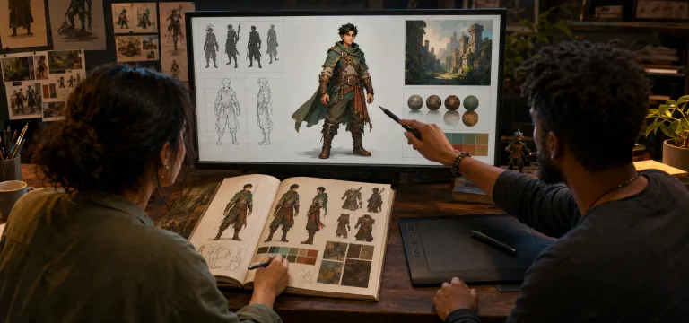
Art Direction in Games: How to Lock a Visual Style Before Production
Locking your game’s art direction is a pre-production decision, not something you discover while assets ship. The short answer: pick the direction on a small set of hero assets before scaling to full production, write it down as a working reference rather than a mood board, and put one named owner in charge of holding it as the asset count grows. Skip any of those three, and the style call you make in week one turns into a rework bill you’re still paying months later, once outsourced artists and a growing team are all touching the same asset set.
3D Game Art Outsourcing in 2026: Costs, Execution Models, & Partner Evaluation Explained
Visual standards in games have escalated sharply. High-poly characters, cinematic environments, real-time lighting pipelines, and engine-optimized assets are now baseline expectations, not premium features. Internal teams, no matter how strong, cannot expand infinitely without affecting cost structure, delivery speed, or creative consistency.
That reality explains why 3D game art outsourcing has shifted from tactical support to strategic production design. The global 3D game art outsourcing market is expected to reach $2.7 billion by 2028, signaling sustained demand from publishers, studios, and IP owners who need scalable art capacity without destabilizing core teams.
When used correctly, outsourcing does not dilute vision. It protects it. It allows internal leadership to retain art direction while external specialists handle production volume, style replication, and pipeline execution. This guide breaks down how 3D game art outsourcing works in 2026, including costs, engagement models, processes, and the studios that execute at scale.